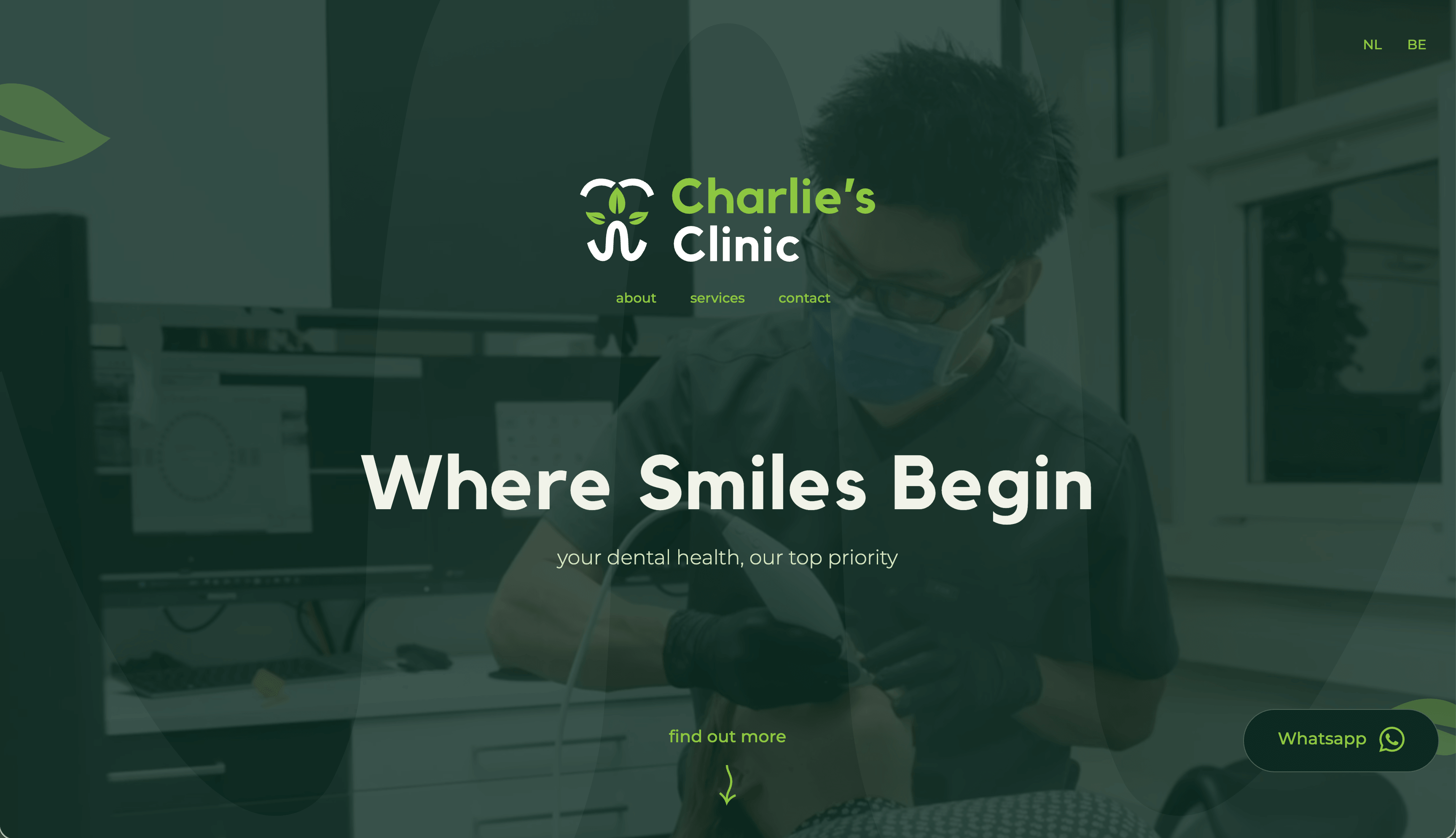
from clinical to approachable.
A fresh, green-led brand and Webflow site for Charlie's Clinic, built around one challenge: making a dental practice feel human and approachable, without dropping the trust patients need to hear from a dentist.
visit the sitethe problem.
Dental is clinical by default. The category visual language is sterile whites and sharp greys, designed to signal hygiene and accidentally signalling coldness. Charlie's Clinic is the opposite kind of dentist: attentive, patient, slow when slow is what helps. The brand had to carry that, without dropping the seriousness the work itself demands.
the process.
Every step carried the same goal: turn clinical into approachable, without losing the trust patients need to feel from a dentist.
the brand the clinic already was.
Charlie's Clinic launched at charlies.clinic with a full identity system, a Webflow site, and brand-in-context applications across the clinic itself, from business cards to window stickers to patient comms. A dental practice that looks and feels like the dentist who runs it.
The hardest part of branding a dentist isn't the leaves around the tooth. It's getting past the category long enough to see the client, and then trusting what you find there.
Dental design has strong defaults: white, sharp, signalling hygiene over warmth. Charlie's Clinic isn't that kind of practice, so the brand couldn't be that kind of brand. The work was less about drawing leaves around a tooth than about getting close enough to see what was already there and trusting it. Brands fit clients; they don't drape on top of them.