back to work
2023 / case study

GamersCloud.

A cloud-gaming portal designed mobile-first across every screen.

UX/UI Design Prototyping Branding
GamersCloud across desktop and mobile

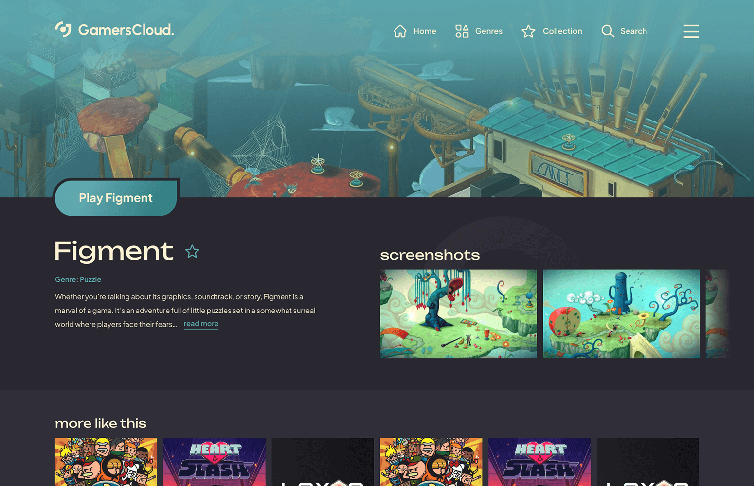
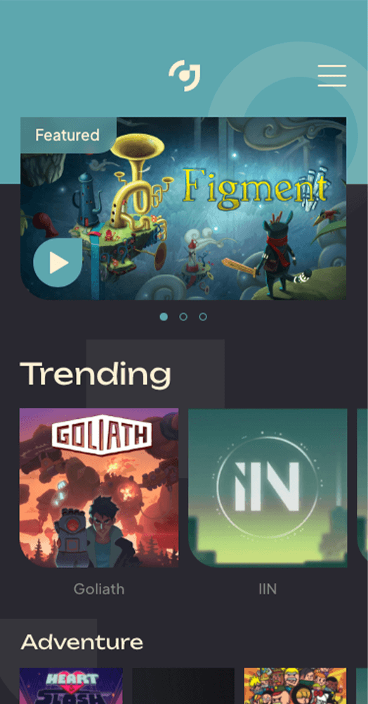
one system, every screen.

GamersCloud is a cloud-gaming portal designed mobile-first and scaled up through tablet and desktop. The whole brand and design system, from type scale to component library, built so the product reads the same on a 5-inch phone and a 15-inch laptop.

YEAR
2023
ROLE
UX/UI Design · Prototyping · Branding
TEAM
Solo
PLATFORM
Web · Responsive
DELIVERED
Handoff · 2023
STATUS
Archived

the problem.

GamersCloud's brief was specific: cloud-gaming players move between a laptop at home and a phone on the bus inside the same session, and the product had to feel native at both ends. One product, one feel, every screen.

laptop at home, phone on the bus one session across two devices no learning between viewports consistency from 5 inches up

the process.

Mobile-first as a working discipline, not a slogan: every decision had to survive a 5-inch screen before it earned a 15-inch one.

01
Start at the smallest viewport
Designed the core flows on the phone first: 5-inch screen, thumb reach, one hand. The decisions that survive that constraint scale up cleanly; the ones drawn on a desktop canvas almost never scale down. Mobile-first as a working method, not a tagline pinned to a moodboard.
02
Push for consistency, not just screens
Worked toward a coherent visual language across the product: type, palette, spacing, and the recurring components. Less about a fully spec'd-out token library, more about making the same decisions consistently from page to page so the product reads as one thing rather than a stack of screens.
03
Draw the brand to match the medium
Cloud gaming sits between TV-game polish and mobile-app immediacy. The brand had to read confident at couch distance and tappable at arm's length. Logo, palette, motion, and iconography tuned across both contexts without becoming generic at either.
04
Carry the session across devices
Designed for the most likely user moment: start a session at the desk, continue it on the bus. The interface had to feel native at both ends without making the user relearn anything in between. Same components, same nav, different posture.
05
Hand it over, ready to build on
Packaged it up for handoff: the brand and the key flows across desktop, tablet, and phone. The work landed ready to build on, even though the product itself didn't end up shipping publicly.

one system, three postures.

Delivered the brand and key flows across desktop, tablet, and phone. The product didn't ship publicly in the end, but the design held together cleanly from a 5-inch phone up to a 15-inch laptop.

Designed mobile-first before any desktop layout
Core flows drawn at 5-inch phone width before scaling up to 15-inch laptop.
Held the design coherent across desktop, tablet, and phone
Same components and nav at every viewport, just a different posture.
Delivered brand and key flows across the three viewports
Pre-launch handoff for desktop, tablet, and phone in 2023.
designing for the device hop

GamersCloud was a chance to design for the context-switch directly: a portal that felt native on a 5-inch phone and a 15-inch laptop without making the user relearn anything in between.

The product didn't end up shipping publicly, and that's the honest part. What I carry forward is the discipline of designing for the device hop from the start: starting at the smallest viewport, holding the design coherent across every breakpoint, and treating each phone, tablet, and desktop as the same product in a different posture. Some projects you carry forward as products; others you carry forward as a way of working.

next case

Horbie.

An audiobook platform designed for kids to love and parents to trust.

read case