warm enough for kids, clean enough for parents.
Horbie is an audiobook platform for kids and the parents who manage what they listen to. Two audiences, one product. Warmth in the design to keep kids engaged, restraint in the parent-facing layer to earn parents' trust.
the problem.
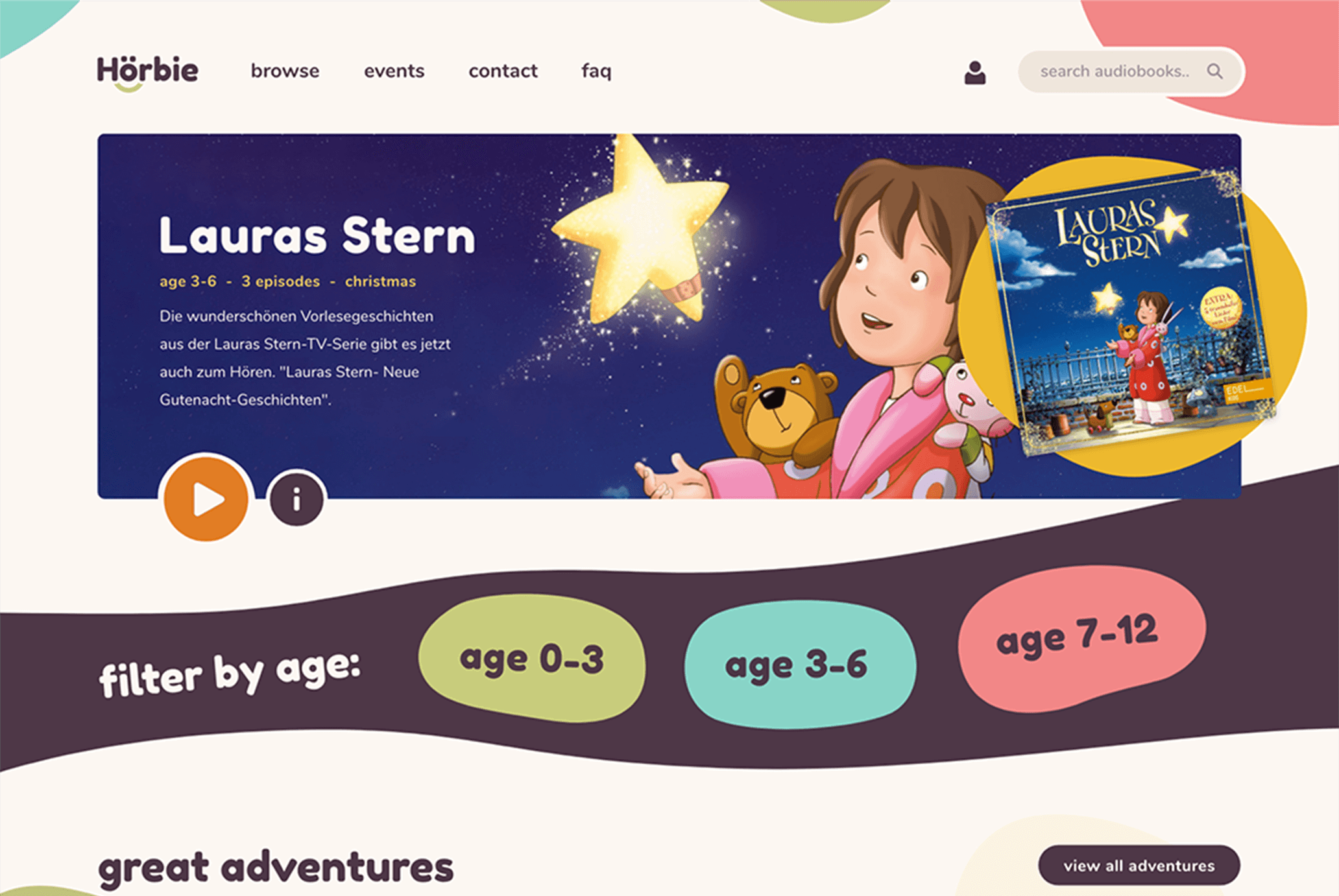
Horbie is an audiobook platform for kids, but kids aren't the ones browsing for what to play. Parents are. The product had to be warm enough that a child wants to use it and clean enough that a parent trusts it on their device. Both audiences, in the same interface, at the same time.
the process.
Designing for two audiences inside one product: the kid on the screen, the parent on the buy.
for the kid and the parent, in the same interface.
Horbie shipped as a complete pre-launch design: identity, prototype, and flows for both the kid and the parent. The product didn't end up launching, but the design holds up as a study in building for two audiences inside one product.
The first audience question for an audiobook platform looks easy: it's for kids. The harder question is who chooses, who manages, and who hands the device over. Horbie taught me to design for both at once, instead of treating one as primary and the other as accessibility.
Most products for kids end up designed for kids alone, with a separate parental-controls page bolted on at the end. Horbie asked the opposite: what if the parent and the kid both feel like the product is for them? The kid layer stays warm and friendly. The parent layer stays calm and free of dark patterns. Both inside the same product. The discipline carries, even though Horbie didn't launch.