back to work
2017 / case study

Bylder.

A home-improvement platform, brand to product, in eight weeks.

UI Design UX Design Branding
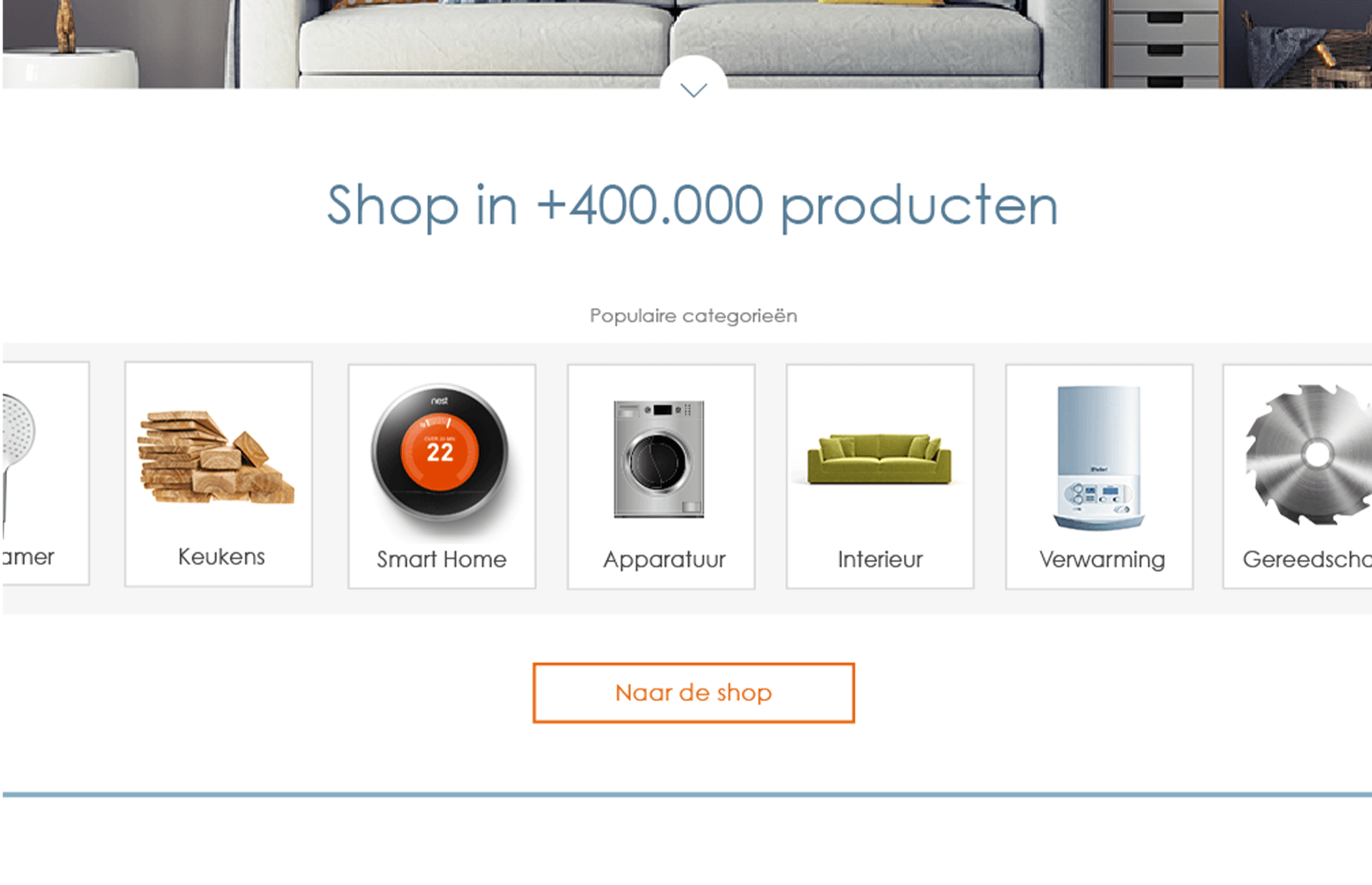
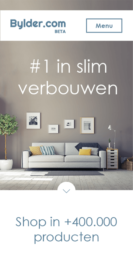
Bylder across desktop and mobile

eight weeks, blank canvas to investor pitch.

Bylder was a home-improvement startup compressing planning, contractor hiring, and materials into one platform. The brief was an eight-week sprint: brand, design system, and complete product design, all from blank canvas to investor-ready beta.

YEAR
2017
ROLE
UI Design · UX Design · Branding
TEAM
Solo
SCOPE
Brand · System · Product
LAUNCH
Beta + investor pitch · 2017
STATUS
Archived

the problem.

Home improvement was scattered: planning lived in one place, contractors in another, materials somewhere else. Bylder's bet was to put the whole journey in one platform. Nothing in the category looked like it, and the runway was eight weeks. The brief: deliver brand, design system, and complete product design, ready to onboard early users and pitch investors.

category fragmented across tools tradesmen-clipart visual defaults no shared identity for the journey blank canvas, eight weeks

the process.

Eight weeks of design, end to end: brand, system, and product, every decision forced to earn its place by the runway.

01
Map the journey before drawing screens
Eight weeks doesn't leave time to wander. Spent the first days mapping the home-improvement journey end to end, naming where the friction lived and where Bylder needed to add value. Every later design decision had to answer back to that map.
02
Design the brand to match the bet
Logo, palette, typography, illustration style, and tone. The category visual language was tradesmen-clipart and orange exclamation marks; Bylder needed to feel confident and human without abandoning the credibility a home-improvement decision demands. Brand first, because every later screen had to ride on top of it.
03
Build the system, ship the core flows
Type scale, colour system, icon set, component library, and the half-dozen core flows that carry the platform: account, project, contractor, materials, planning tool. The system did the heavy lifting so the screens could come together quickly.
04
Land the landing page
The landing page had a double job: pitch the product to investors and onboard early users. Concise, confident, visibly different from anything else in the category. The mood set there had to carry through the rest of the platform.
05
Ship the beta in eight weeks
Final deliverable: brand, design system, complete product design, ready for early users and investors. Delivered in two months. Tight constraints sharpened every decision; nothing went in that didn't have to.

blank canvas to investor-ready in eight weeks.

Bylder shipped on time: brand, design system, and complete product design, delivered from blank canvas to investor-ready beta in eight weeks. Used to onboard early users and to pitch.

Delivered brand, design system, and product design end to end
Two months from blank canvas to investor-ready beta.
Compressed the home-improvement journey into a single product
Planning, contractor hiring, and materials all in one platform.
Onboarded early users and supported the investor pitch
Pre-launch use and pitch deck, 2017.
constraints sharpen the work

Eight weeks doesn't leave room to second-guess. Every design decision had to earn its place, fast. That constraint taught me more about scope and judgement than any longer project I'd done up to that point.

Most early-career briefs come with too much rope. Bylder came with the opposite: a runway short enough that I couldn't polish anything that didn't matter, and a brief broad enough that I had to build the brand, the system, and the product all at the same time. The bits that survived the eight weeks were the bits that genuinely worked. That's not a methodology I'd put on every project, but it's a discipline I've reached for ever since.

next case

Spruit.

A plant-care app that learns the rhythm of your home.

read case